Retail Cybersecurity in 2026: Rethinking Security for the Modern Retail Enterprise
Why traditional security models are failing modern retail — and the architectural shift CISOs need to protect loyalty data, cloud infrastructure, and guest trust.
“Heuristic” is an old Greek word that means to find or invent. The etymology is this:
From gr. εὑρίσκεινheurískein, ‘find’, ‘invent’
Cambridge dictionary also provides us with an interesting definition, Heuristics: “A method of learning or solving problems that allow people to discover things themselves and learn from their own experiences”
At this point, you are probably wondering what an ancient Greek method has to do with usability in digital products. Right? Well, the person who found a connection between the Greek method and digital products is Jakob Nielsen, Ph.D. in human-computer interaction in the Technical University of Copenhagen, Dinamarca and former VP of research in Apple Computer.
Jakob Nielsen describes for the first time in 1994 in his book “Usability Inspection Methods” – the Heuristic evaluation methodology. This fundamentally verifies whether a product contains a set of rules that allow the users to learn by themselves everything they need to know to use the product comfortably and without friction.
There are various sets of rules we can use for the purpose of conducting a heuristic Evaluation like the “20 Usability Heuristics” (Weinschenk and Barker, 2000) or the “6 Design Principles for Usability” (Don Norman, 1988). Today, the most widespread set of rules that we focus on are the “10 Usability Heuristics for User Interface Design” (Jakob Nielsen, 1994).
Also read: Designing UX for the Color Blind
The system should always keep users informed about what is going on, through appropriate feedback within a reasonable time.
We at Altimetrik use proper components to show the system status at a given moment. The correct use of loading bars or layout placeholders, and success and error messages just to name a few, help the users to understand what the system is doing or if their actions were successfully done or not.

The system should speak the users’ language, with words, phrases and concepts familiar to the user, rather than system-oriented terms. Follow real-world conventions, making information appear in a natural and logical order.
We strive to use natural language to communicate errors in the products. Also using icons that depict real-world objects that perform actions equivalent to the actions the user will perform in the product (like the camera icon to take a picture in an app with your phone) result in a better understanding of the products from the users who already know what the real-life counterparts do.

Users often choose system functions by mistake and will need a clearly marked “emergency exit” to leave the unwanted state without having to go through an extended dialogue. Support undo and redo.
In the products we create at Altimetrik, we try to use not only undo and redo buttons, but another way to provide the user more control over their actions is also by the use of back and cancel buttons every time a user wants to change something in the system, that way they can leave the screen they pretended to change the status without applying the changes if they want to.

Users should not have to wonder whether different words, situations, or actions mean the same thing. Follow platform conventions.
The use of design systems (following “Brad Frost, Atomic Design” like guidelines) is a common practice in Altimetrik designed products, this allows us to maintain a visual consistency that helps the users create mental models on how to use our products and predict for instance what a button will do based on previous experiences with the product.

Even better than a good error message is a careful design which prevents a problem from occurring in the first place. Either eliminate error-prone conditions or check for them and present users with a confirmation option before they commit to the action.
All of the products we design at Altimetrik have very conscious use of confirmation dialogues for destructive actions that a user may regret, we don’t want a miss to click to ruin anyone’s day! Also showing in real-time as the user is typing if it meets the requirements for a specific field, let’s say a password, may avoid the user entering an incorrect format value, and receive an error message.

Minimize the user’s memory load by making objects, actions, and options visible. The user should not have to remember information from one part of the dialogue to another. Instructions for use of the system should be visible or easily retrievable whenever appropriate.
Display descriptions along with the components, provide radio buttons or checkboxes with options instead of text input fields whenever possible and use visible navigation instead of hidden navigation just to name a few. These are all good practices to reduce the cognitive load of users.

Accelerators (unseen by the novice user) may often speed up the interaction for the expert user such that the system can cater to both inexperienced and experienced users. Allow users to tailor frequent actions.
Providing a certain degree of customization in the UI helps the users to speed up their workflows by allowing them to organize the information according to their own needs. The inexperience of designing several data visualization dashboards, we have enabled users to reorganize the tiles that allow defining an information architecture that is always tailored for them.

Dialogues should not contain information which is irrelevant or rarely needed. Every extra unit of information in a dialogue competes with the relevant units of information and diminishes their relative visibility.
We always strive for minimalistic design at Altimetrik, making sure that the important pieces of information don’t get lost in crowded screens. The use of multiple-step wizards instead of long forms or dividing complex flows along multiple but clean screens instead of having few screens with too many actions is always preferred. In today’s design, the number of clicks is not as important as how easy (or hard) is it to find the button that will allow me to move in the direction I want.

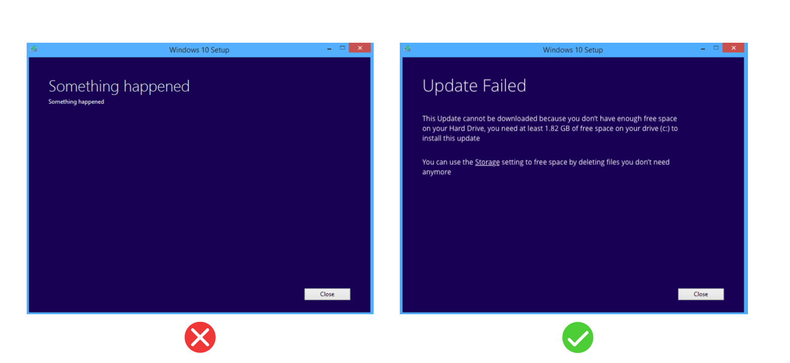
Error messages should be expressed in plain language (no codes), precisely indicate the problem, and constructively suggest a solution.
There is nothing more frustrating than an error you don’t know how to recover from. That’s why we pay special attention to the error messages that range from error screens, alerts, toasts, etc. Even if each one of them has specific goals, all of them speak to the user in natural language with an appropriate tone that is decided by our UX writers.

Even though it is better if the system can be used without documentation, it may be necessary to provide help and documentation. Any such information should be easy to search, focused on the user’s task, list concrete steps to be carried out, and not be too large.
It is very important to incorporate this vital aspect to offer the best possible help to the users. From properly designed help sections to step by step tutorials for newcomers, our products always provide enough documentation to help the users dissipate any doubt they may have about the product or how to use it.

These guidelines are extremely helpful for UX teams to create products that are easy to use and can increase user stickiness. UX has a crucial role in defining the success of ideas and concepts, especially in these changing times of Covid-19.
Would you like to get a Heuristics evaluation of your product? Connect here.

Why traditional security models are failing modern retail — and the architectural shift CISOs need to protect loyalty data, cloud infrastructure, and guest trust.

Discover how Salesforce Education Cloud, Data Cloud, and Agentforce enable AI-driven student engagement and intelligent campuses with Altimetrik.

Learn how a fragmented call center evolved into an intelligent service platform, boosting operational efficiency, enhancing customer experience, and delivering actionable insights at scale.
Altimetrik is committed to protecting your personal information. To apply for a position, you will need to provide your email address and create a login. Your information will be used in accordance with applicable data privacy laws, our Privacy Policy, and our Privacy Notice.
